Food Finder
Grocery Store App
Prompt: Design an app and a responsive website for a local grocery store that helps shoppers locate products as they shop in person.
The following is a brief overview of my workflow and creation process for this project.
More details can be found in the Case Study. Feel free to give it a look.
Research:
When researching for this app, I was interested to see how much grocery shopping had been affected by COVID. To my surprise, as from consistent supply chain issues in some neighborhoods, most of the complains from sources I find from pre-2020 were pretty to post-2020.
Common complaints:
Stores can be crowded
Items can be out of stock with no indication
Items can be tough to find
shopping can be too time consuming in a busy day
Buyers can forget to buy items
Cost/limited funds

Ideation:
Compared to the previous project, this sitemap would be much larger and would would turn out ot be the largest one I’ve created so far.
While doing a competitive audit, I noticed a couple indirect competitors listed recommended recipes. I thought this would be a good resource to users who expressed issues feeling overwhelmed with planning. I also wanted to seamlessly integrate featuers that would allow users to directly add recipe items to their cart from the recipe page so they wouldn’t have to look up each item individually.
I was unsure if this would be a feature users would want. But during our interviews, a couple interviwees said they were interested in the idea.

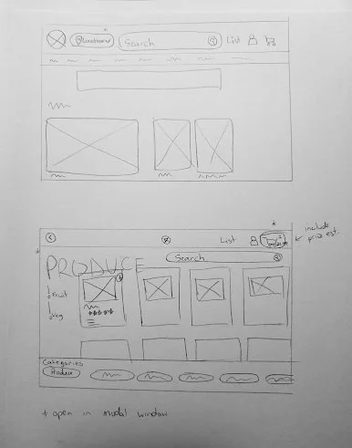
Wireframing:
Other notable featues to include:
show stock
list aisle for product
list shelf height
“Add” symbol to easily add to cart
Include estimated price calculation
make sure search easily available
Paper wireframes:
Digital wireframes:


Prototyping:
Shortly after creating the lofi prototypes, I had my first round of interviews. I wanted to conduct them without the images as that would give an idea of how usrs responsded to the layout and text without assistance from the images. This seemed like a good way to test some aspects accessibility for users with screen readers even though I know screen readers can read alt text on images.
In addition to a couple in-person interviews, I created a SurveyMonkey questionnare with inlcuded usability tasks.
Feel free to have a look: https://www.surveymonkey.com/r/C922M5B


Refining
While I’d used Fima before for coming up with web designs, I hadn’t had anyone else vieweing my prototypes remotely. I ran into issues immediately were users weren’t exactly sure how to “begin”. This was because the “play” button I’d created a was technically on top of the frame and not IN the frame, so in the prototype, it was invisible.
Creating protypes to be tested instead of just brainstorming also required delving into topics like copmonents and states. I also learned how to prototype popup windows and modals. I’ve learned a lot since this point which can be seen futher projects. While the prototype is still functional, there are many ways I’ve learned to save space so that my Figma files are easier to read for collaborators.


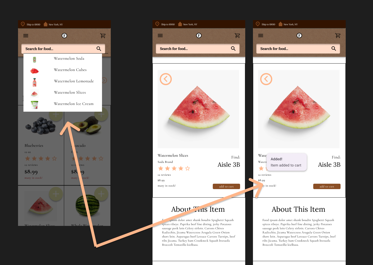
Instead of creating a separeate confirmation frame or popup frame in Figma, these could have just been modal interactions.
Takeaways
Iterating on designs is an ongoing process
I’d love ot to usability tests on the app again when I have more time. I followed the Web Content Accesibility Guidelines while creating this. But I’d like to delve into more ways to make this app accessible.
There are many powerful ways to reuse assest in Figma
Getting better at using states and components in Figma makes as world of a difference in cutting back on space and time. As stated before, I already had experience using Figma. But after learning more, there’s even more ways I’ve learned to save time that I can see clearly in hidnsight.
